Zentlemens
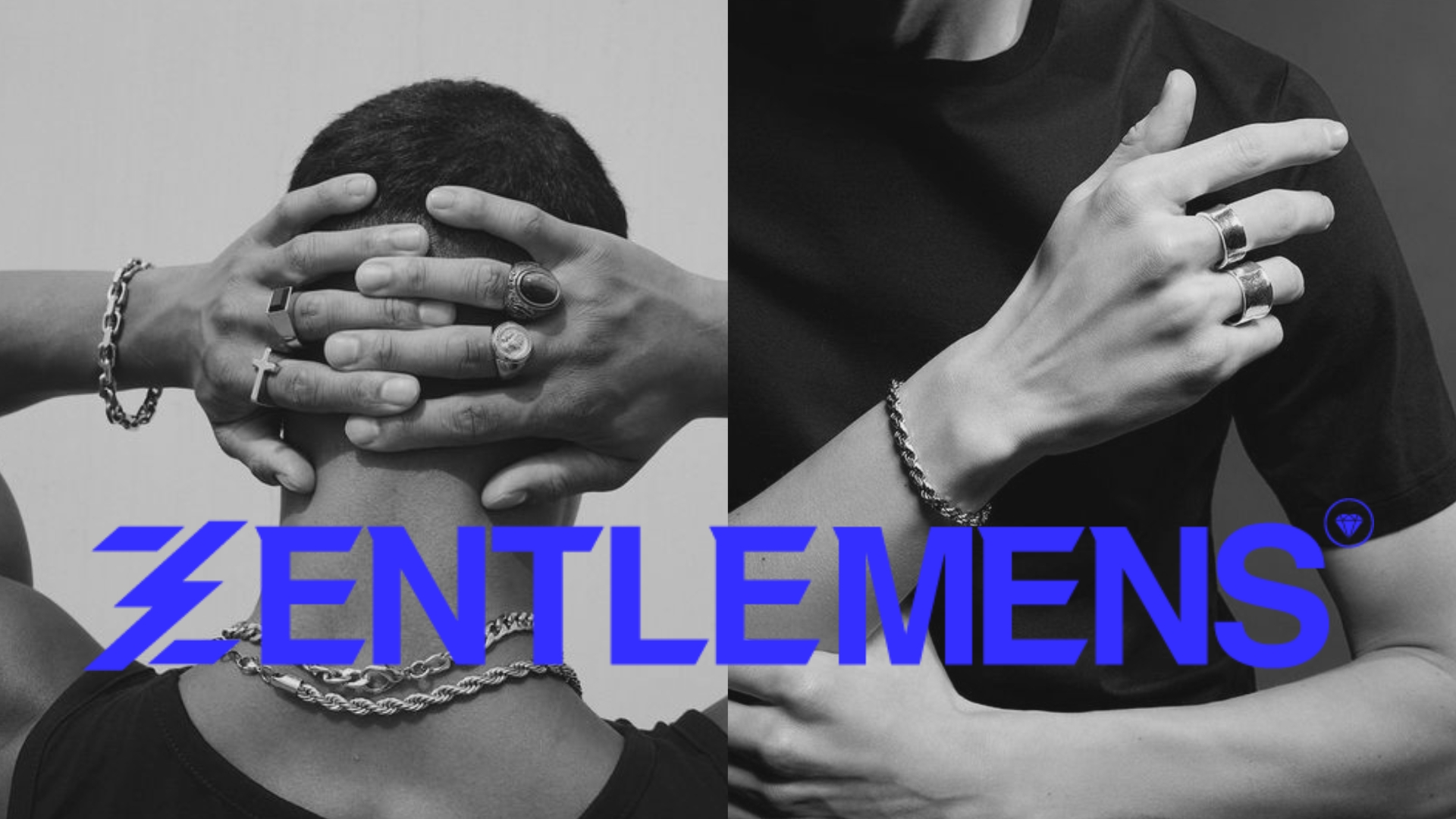
As the designer behind the scenes, I had the privilege of working on the Zentlemens project. Zentlemens is not just a jewellery brand, it’s a lifestyle. They're dedicated to helping customers express their individuality through their unique pieces. Their aim is to provide an exceptional shopping experience, guiding customers on their style journey. At Zentlemens, they craft stories and build a community of individuals who dare to stand out.
- Client
Zentlemens
- Year
2024
- Scope of work
Naming, Logo Design, Brand Identity Design, Social Media Branding, Marketing, Web Design.
The Metaphor
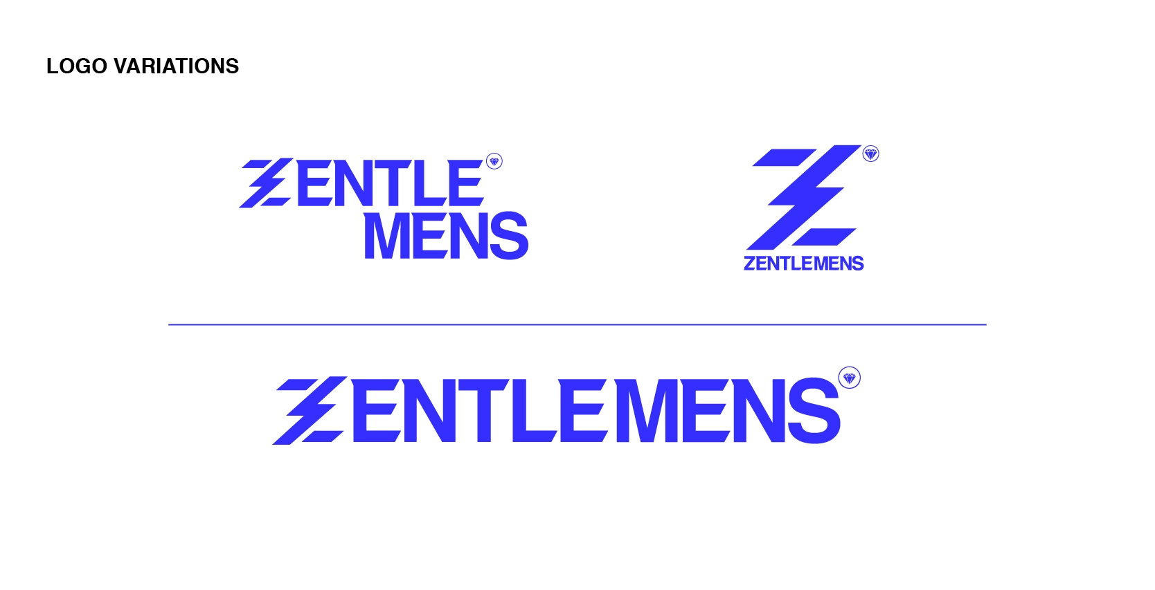
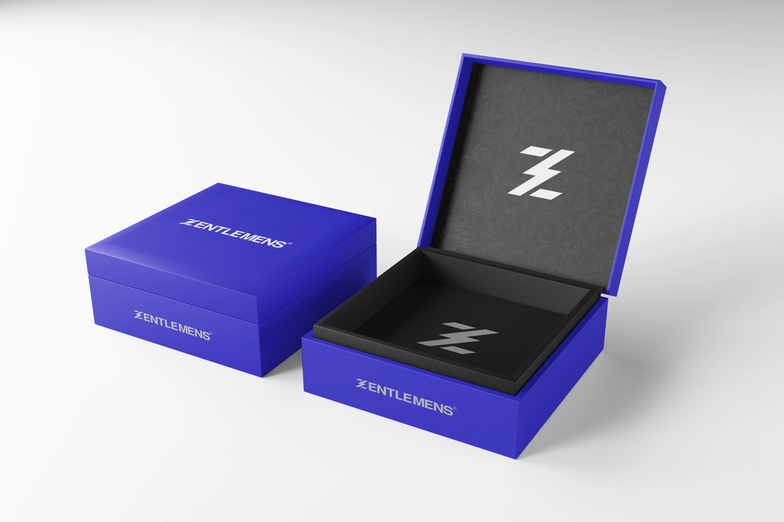
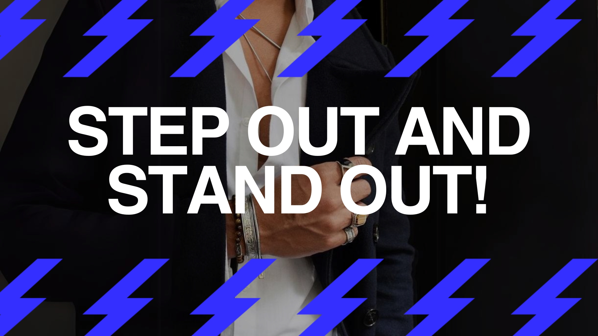
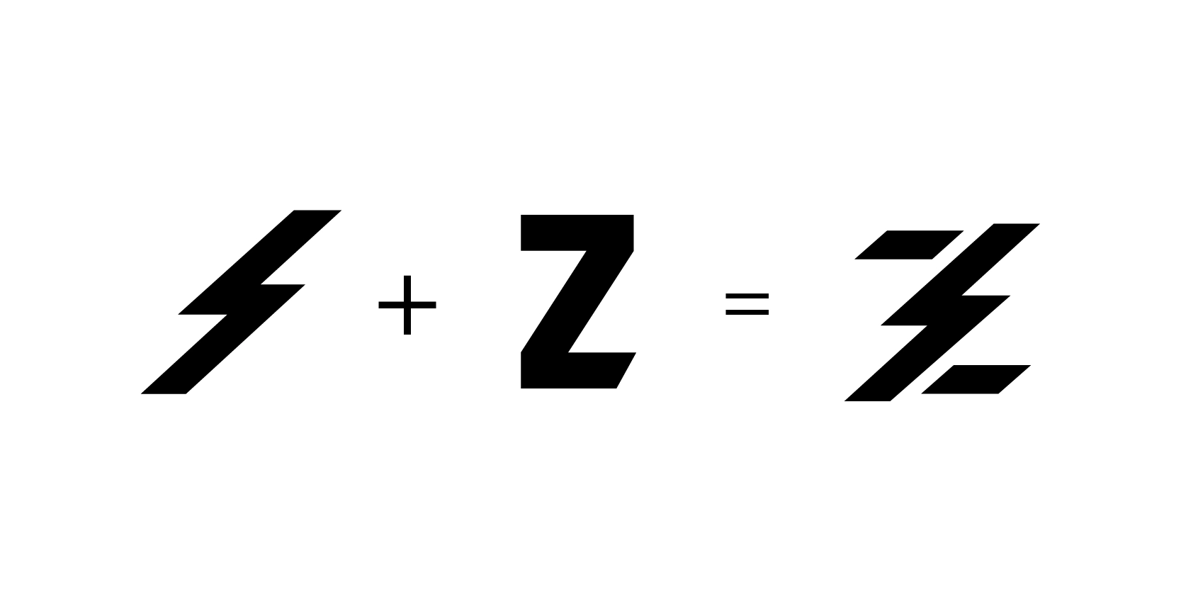
The ‘Z’ represents the brand name, Zentlemens, and signifies the uniqueness and individuality of our customers. The electric bolt symbolizes energy, power, and the spark of creativity that Zentlemens aims to ignite in its customers.
The Challenge
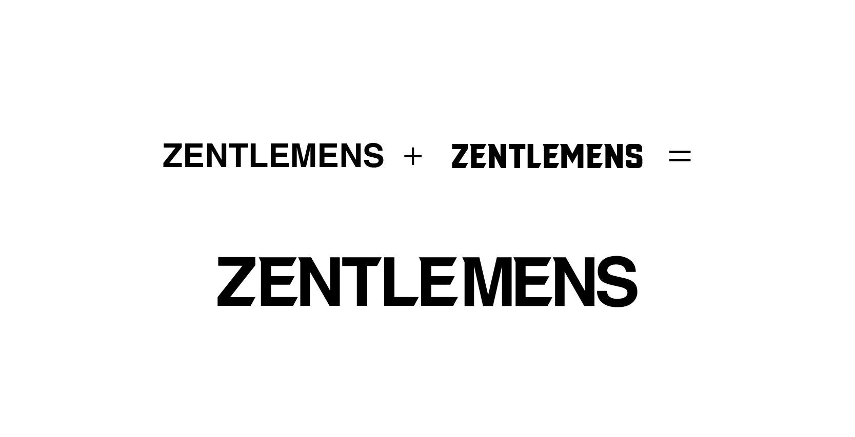
The primary challenge in creating the Zentlemens logo was the typography. As a text-based logo, it was crucial to find a typeface that was strong, bold, modern, and energetic. The typography needed to embody the brand’s identity and resonate with its target audience.
The Solution
To address this challenge, we sought to infuse a sense of sharpness and modernity into the text. We customized the text using VTF Redzone Classic for its sharpness and Helvetica for its contemporary appeal. The result is a text that is both modern and impactful, perfectly encapsulating the Zentlemens brand. This unique combination of elements forms the Zentlemens logo icon, a powerful visual representation of the brand’s identity and values. This approach ensured that the logo is not only visually appealing but also embodies the brand’s ethos and resonates with its target audience.
